6 Button Styles for Your Shopify Store, With Copy-Paste CSS
In this article5 sections
Buttons are where shoppers act: add to cart, check out, sign up. A clear, consistent button style makes those actions easy to find, especially on a phone. Below are six button styles we use as starting points in client stores, each with CSS you can paste straight into your Shopify theme.
Where to paste the CSS in Shopify
Open your Shopify admin and go to Online Store > Themes > Customize. The theme editor has two places for custom CSS:
- Theme settings > Custom CSS applies the code to the whole store. Shopify limits it to 1,500 characters.
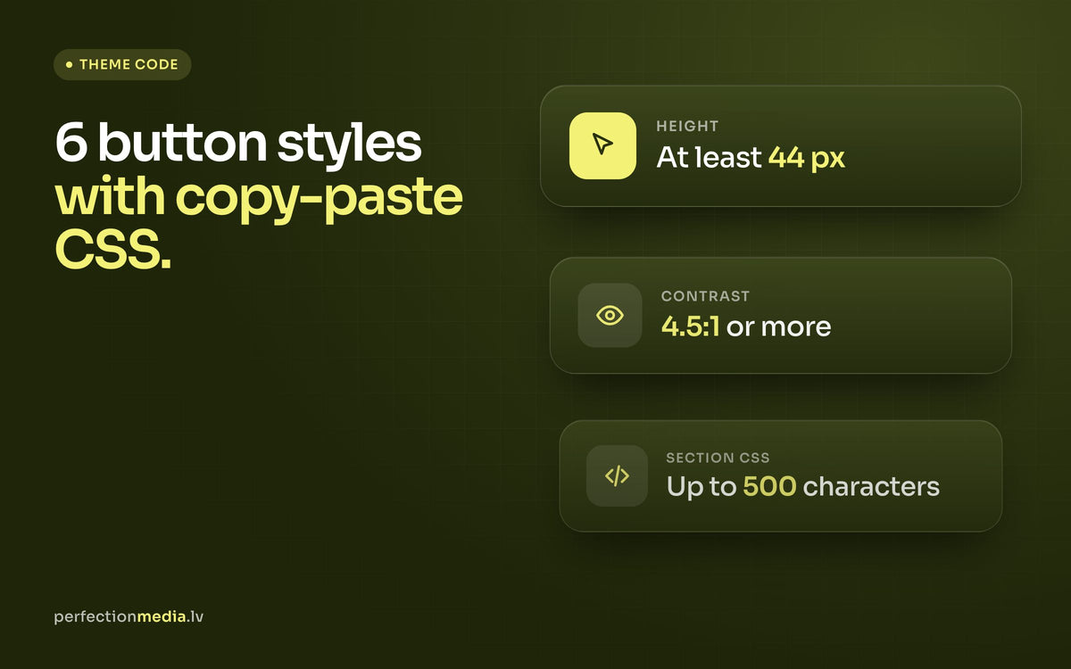
- A section's Custom CSS applies the code to that section only. Click the section, scroll to the bottom of its settings and paste the code into the Custom CSS field. The limit here is 500 characters.
Every example below fits within the 500-character section limit. CSS added to a section is scoped to that section, so a rule for .button only changes the buttons inside it. Custom CSS takes precedence over the theme's built-in button settings. It does not apply to the checkout page.

Find your button's class name
- Open your store in Chrome or Firefox and right-click the button you want to change.
- Choose Inspect. You can also open the developer tools with Cmd + Option + I on a Mac or Ctrl + Shift + I on Windows.
- Look at the
classattribute of the highlighted element. Many themes usebutton; others use names such asbtnorproduct-form__submit. - If your class is different, replace
.buttonin the examples with it.

Six button styles with CSS
All six use colour pairs with readable contrast and a minimum height of 44 pixels, which keeps them easy to tap. Change the hex colours to match your brand.
1. Simple flat button
Clean and modern, with no border or shadow. It suits minimal themes and works well as the main button on a page.

.button {
  background-color: #f4f276;
  color: #1a1a1a;
  border: none;
  border-radius: 0;
  padding: 12px 24px;
  min-height: 44px;
  font-size: 16px;
  text-decoration: none;
  cursor: pointer;
}
2. Rounded button
Fully rounded corners give a softer, friendlier look. Popular with beauty, kids and lifestyle brands.

.button {
  background-color: #1e7e45;
  color: #ffffff;
  border: none;
  border-radius: 999px;
  padding: 12px 28px;
  min-height: 44px;
  font-size: 16px;
  text-decoration: none;
  cursor: pointer;
}
3. Outline button
A transparent button with a coloured border. Use it for secondary actions, such as "View details" next to a filled "Add to cart" button.

.button {
  background-color: transparent;
  color: #2e7d32;
  border: 2px solid #2e7d32;
  border-radius: 4px;
  padding: 10px 22px;
  min-height: 44px;
  font-size: 16px;
  text-decoration: none;
  cursor: pointer;
}
.button::before,
.button::after {
  box-shadow: none;
}4. Gradient button
A colour gradient draws the eye, so save it for one important action per page. You can build your own gradient with a tool such as CSS Gradient.

.button {
  background: linear-gradient(to right, #3c9342, #f4f276);
  color: #1a1a1a;
  border: none;
  border-radius: 4px;
  padding: 12px 24px;
  min-height: 44px;
  font-size: 16px;
  text-decoration: none;
  cursor: pointer;
}
5. Shadow button
A soft shadow lifts the button off the page and makes it look clickable.

.button {
  background-color: #8e44ad;
  color: #ffffff;
  border: none;
  border-radius: 4px;
  padding: 12px 24px;
  min-height: 44px;
  font-size: 16px;
  text-decoration: none;
  cursor: pointer;
  box-shadow: 0 4px 6px rgba(0, 0, 0, 0.2);
}
6. Hover button
The colour changes when the cursor moves over the button, which confirms it can be clicked. This example also adds a visible focus outline for keyboard users and turns off the animation for visitors who have reduced motion enabled on their device.

.button {
  background-color: #c0392b;
  color: #ffffff;
  border: none;
  border-radius: 4px;
  padding: 12px 24px;
  min-height: 44px;
  transition: background-color 0.3s ease;
}
.button:hover {
  background-color: #a93226;
}
.button:focus-visible {
  outline: 3px solid #1a1a1a;
  outline-offset: 2px;
}
@media (prefers-reduced-motion: reduce) {
  .button { transition: none; }
}
Make buttons easy to use
- Contrast. Text on a button needs a contrast ratio of at least 4.5:1 against the background (WCAG AA). White text on light yellow or bright green fails, so those examples use dark text.
- Size. Buttons at least 44 pixels high are comfortable to tap on a phone, where most of your visitors shop.
- Focus. Never remove the focus outline without adding your own. Keyboard users need to see where they are.
- Clear text. Write what happens: "Add to cart", "Go to checkout". Avoid vague labels such as "Submit".

Buttons and conversion
Pick one style for the main action and one for secondary actions, and use them consistently across the store. When every button looks equally loud, shoppers have to think about where to click. A single, clearly dominant button on the product page usually works better than several competing ones. For more ideas on getting visitors to buy, read our tips for increasing online store sales.
Custom CSS is tied to your theme's class names, so a theme update can change them. After each update, check that your buttons still look right. If you are setting up a new store, our Shopify store setup guide covers the basics before you start styling, and the complete Shopify store development guide covers the full process.