How to Raise Your Shopify Store's Conversion Rate: 9 Practical Fixes
In this article11 sections
- Start with your own numbers
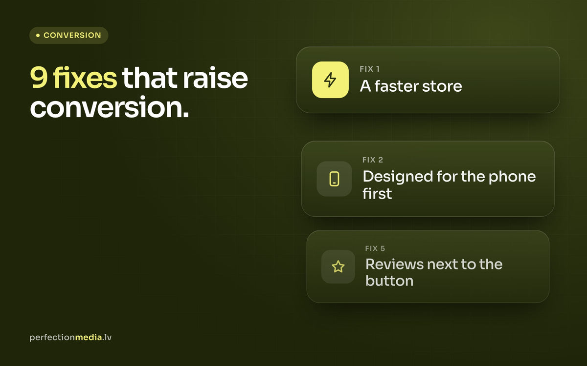
- 1. Make the store faster
- 2. Design for the phone first
- 3. Show the product properly
- 4. Answer delivery and returns questions early
- 5. Put reviews where decisions happen
- 6. Help people find products
- 7. Simplify the cart and checkout
- 8. Bring back visitors who left
- 9. Test one change at a time
- Where to start
More traffic is the expensive way to grow sales. Converting more of the visitors you already have is usually cheaper, and the gains last. This article collects the fixes we return to most often when reviewing Shopify stores, roughly in the order we check them. None of them needs a full redesign, and most can be done in a few days.
Key takeaways
- Find out where visitors drop off before you change anything.
- Speed and mobile usability affect every other fix on this list.
- Answer the buyer's questions on the product page: photos, size, delivery, returns and reviews.
- Change one thing at a time and compare equal periods, so you know what worked.
Start with your own numbers
There is no universal "good" conversion rate: it depends on your category, price level, traffic sources and season. The useful comparison is your store against its own past. In Shopify analytics, look at the conversion funnel: sessions, sessions with an add to cart, sessions that reached checkout and completed orders.
The step with the biggest drop is where to start. Plenty of visitors but few add to carts points to product pages or prices. Plenty of add to carts but few orders points to delivery costs, payment options or checkout. Check mobile and desktop separately, because they often tell different stories.

1. Make the store faster
Slow pages lose visitors before they see a single product. The most common causes on Shopify stores are easy to fix:
- oversized images uploaded straight from a camera or design tool;
- apps you no longer use that still load scripts on every page;
- several tracking and chat widgets loading at the same time;
- autoplaying videos and large sliders at the top of the home page.
Test on a mid-range phone over mobile data, not only on an office computer. Google PageSpeed Insights shows which elements slow a page down.
2. Design for the phone first
For most stores, most visits come from phones. Walk through the whole path on a phone: can you see the price and the add-to-cart button without much scrolling, is the text large enough, do pop-ups cover the page, can you pick a size with your thumb? On long product pages, an add-to-cart bar that stays visible while scrolling often helps.

3. Show the product properly
Photos and video
Online, the photo replaces holding the product. Use several sharp images: the product on a clean background, the product in use, close-ups of materials and details, and something that shows scale. A short video is worth adding wherever movement, texture or fit matter.
Descriptions that answer questions
Write for the buyer, not the catalogue. Start with what the product does for the customer, then list the facts: dimensions, materials, compatibility, care. If customers keep emailing the same question, the answer belongs on the product page. Add a size guide wherever fit matters.
4. Answer delivery and returns questions early
Unexpected costs at checkout are one of the most common reasons people abandon a purchase. Show delivery options, prices and times on the product page near the add-to-cart button, together with one line about returns. If delivery is free above a certain order value, say so in the announcement bar and show in the cart how much is left to reach it.
5. Put reviews where decisions happen
Reviews work best next to the price and the button, not only at the bottom of the page. Request a review automatically a few days after delivery, and show photo reviews if your review app supports them. Keep negative reviews visible and reply calmly: a store with only perfect ratings looks less credible. Our article on handling negative reviews in an online store explains how to reply.
6. Help people find products
Keep the main menu short and use the words your customers use. On collection pages, add filters that match how people choose: size, colour, price, type. Make search visible on mobile and check what it returns for popular product names and common misspellings. A search with no results should still suggest popular products.
7. Simplify the cart and checkout
Shopify's checkout is already fast and well tested, so most gains come from the settings around it:
- offer the payment methods your customers expect, including express options such as Apple Pay and Google Pay, and bank links in the Baltics;
- offer the delivery methods they prefer, for example parcel lockers;
- allow guest checkout instead of forcing customers to create an account;
- keep the cart clean: one clear checkout button, the total including delivery and at most one relevant add-on offer.
8. Bring back visitors who left
Most visitors will not buy on their first visit. Abandoned cart and browse abandonment emails remind them of what they looked at, and a welcome series turns new subscribers into first-time buyers. Once these automated flows are set up, they work every day without extra effort. This is the core of our email marketing work with Klaviyo.
9. Test one change at a time
If you change ten things in one week, you will not know which one helped. Make one change, wait until you have a meaningful number of orders, then compare with a period of the same length before the change, keeping seasons and campaigns in mind. Keep a simple log of what you changed and when.
Where to start
If you only have one afternoon: test the store on your phone, compress the largest images, uninstall apps you no longer use and add delivery information to your product pages. If sales have been flat for months despite steady traffic, our article on why e-commerce sales stagnate and how to fix it covers the wider causes.